How To
How to Use Image Effects in Silhouette Studio

Aug
In this informative tutorial, we’ll explore the Image Effects panel in Silhouette Studio, which allows for basic editing of raster photos, clipart, and designs containing pattern and gradient fills. While Silhouette Studio may not be a full-fledged image editing software, the Image Effects panel offers useful tools for enhancing your designs and adjusting various elements.
Follow our step-by-step instructions to learn how to use Image Effects in Silhouette Studio to make basic edits to your raster photos and clipart. You’ll also discover how to adjust pattern and gradient fills to achieve the desired visual effects.
Let’s dive into the world of Image Effects in Silhouette Studio and unlock the potential to enhance your designs with ease and creativity. Get ready to add a touch of refinement to your crafting projects with the versatile tools in the Image Effects panel!
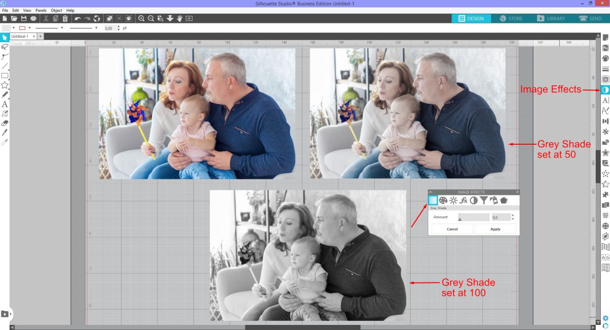
Step 1 – Apply Grey Shade or greyscale effect
Grey Shade is a greyscale version of the color photo. A soft tone is added to color photos which can be very appealing. Click on the Image Effects panel on the right side of the screen to open. Click the photo to select then click Grey Shade.
Increase the Amount until you get the desired effect. The Grey Shade Effect doesn’t need to be fully greyscale. It can be used to create a muted tone if the colors have too much contrast. Experiment with the Amount between 50 to 100 to see the difference.
Once you click Apply the editing properties will be set. You can then further edit with the other Image Effects options like Contrast, Brightness and Saturation.
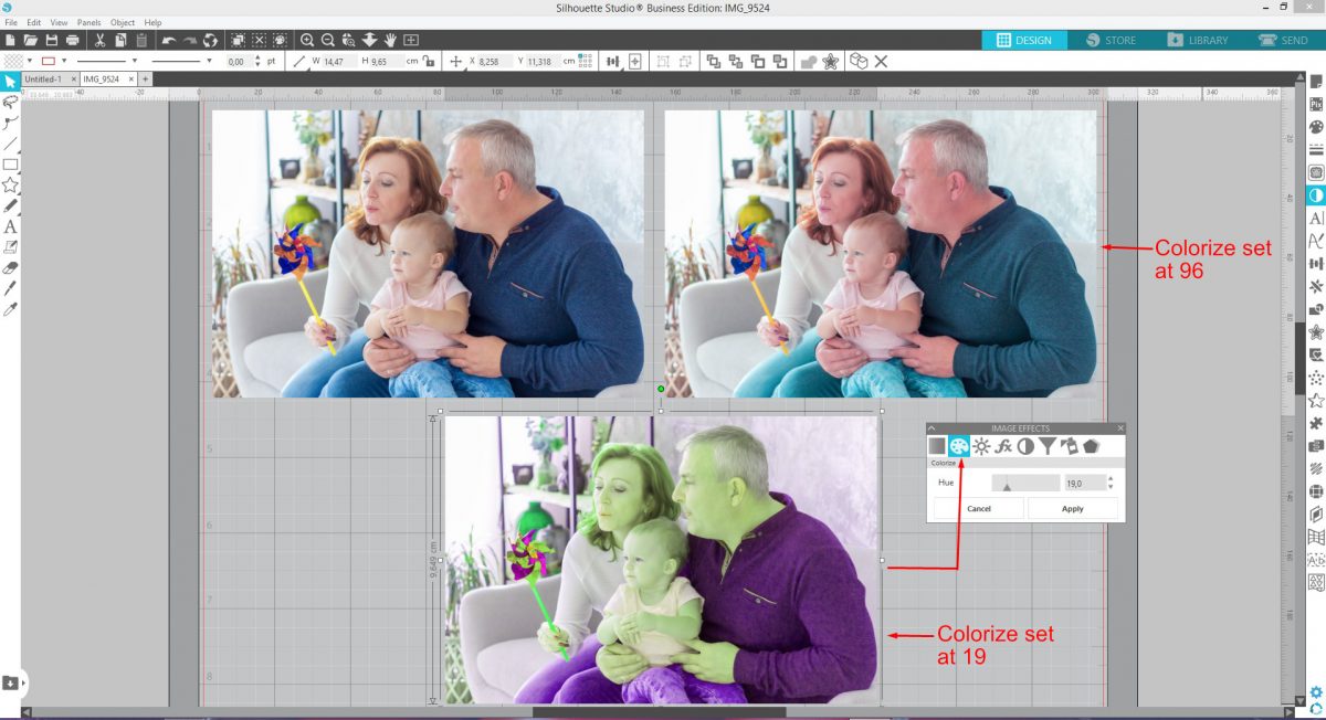
Step 2 – Add and edit Colorize Effect
The Colorize Effect adjusts the Hue of the photo. This can produce some interesting and weird effects. The effect may work best with a clip art image than a photo depending on the look you want.
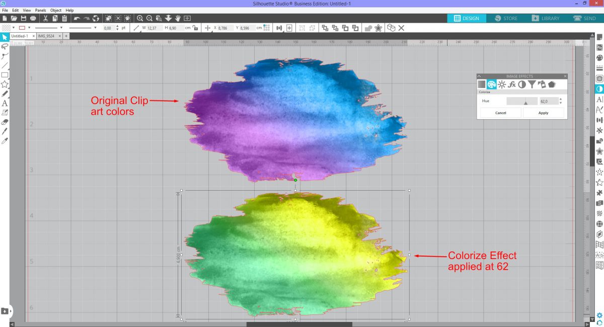
For this example, we used a photo and a watercolor paint stroke. As Colorize affects the entire photo, it can look extreme. If used closer to 0 or 100 the effect is less strange. Click Colorize and adjust the Hue for the desired effect.
The watercolor paint stroke gives a better result with the Colorize Effect. The colors change as the slider is moved to the right. We can create various color combinations with one clip art image.
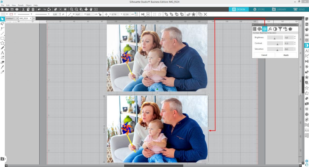
Step 3 – Adjust Contrast, Brightness and Saturation
To make your photos pop a bit more the Contrast, Brightness and Saturation are adjusted. Dragging the sliders right decreases the effect while left increases.
Contrast is the difference between the light and dark areas. Increasing makes bright areas lighter and shadow areas darker.
Brightness will adjust the overall light and dark areas. Increasing brightens the entire photo. Decreasing darkens the entire photo.
Saturation increases the intensity of colors or hues. Increasing causes the colors to be much stronger. Decreasing mutes the colors and if brought down to 0 all color is removed. You are then left with a greyscale image.
With your photo selected, adjust the sliders of Contrast, Brightness and Saturation. At times, decreasing Saturation can help with reducing redness in the face or overly strong colors.
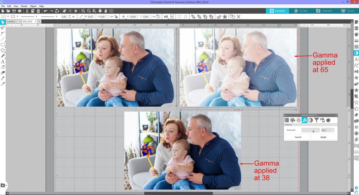
Step 4 – Using the Gamma Effect
The Gamma Effect is the smooth transition between black and white. The slider is set at 50 by default. Decreasing the number will increase the intensity across the photo. Increasing will soften the intensity of the photo.
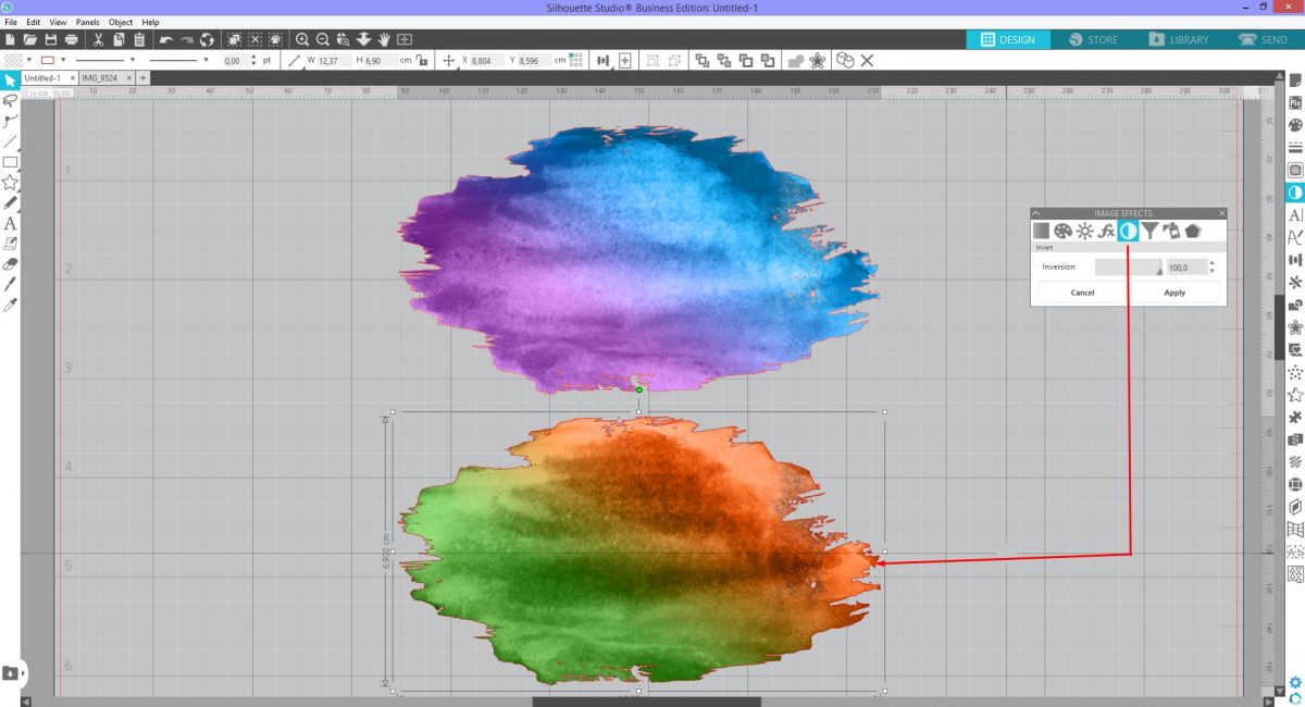
Step 5 – Adjust the Invert Effect
Inverting colors in the photo creates a type of negative. This is useful for photos or designs that are difficult to trace. Projects like etching benefit from using the Invert Effect when combined with tracing.
Click on your photo then click on Invert. Move the slider to the right to see the effect. Detailed areas such as hair stand out more from the background.
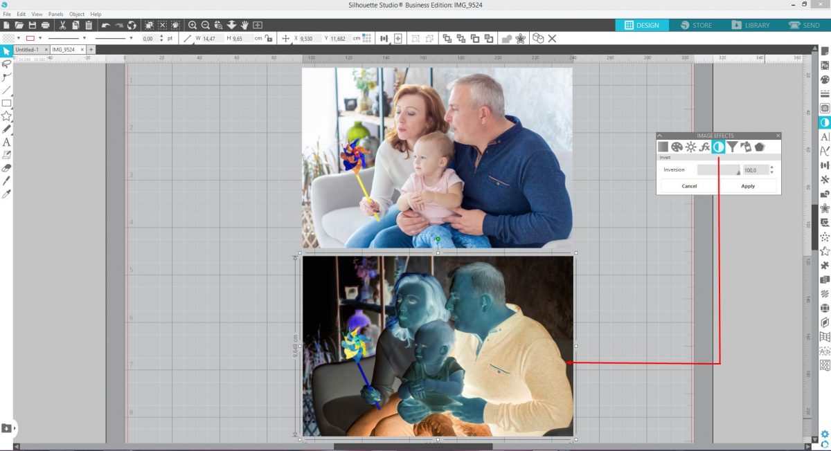
When applied to clipart images, bright and dark areas are inverted. In the example below, the edges of the original clipart are light. It may cause issues if tracing is needed. When inverted, the edges are darkened and more defined.
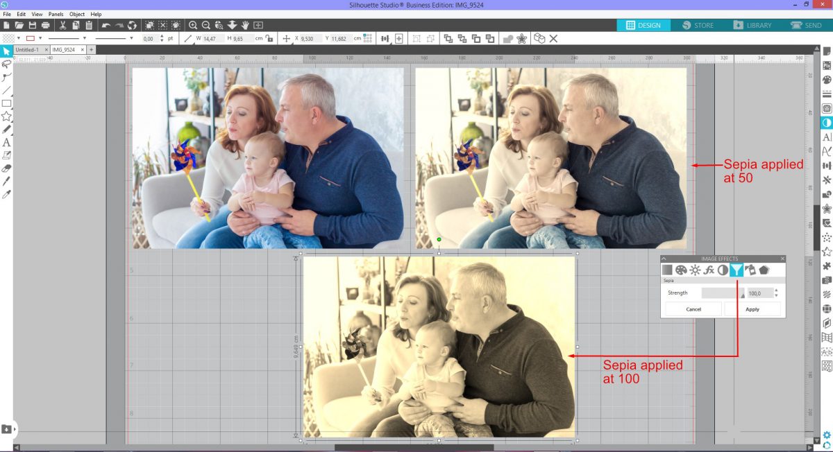
Step 6 – Apply the Sepia Effect to the photo
Sepia is a tonal affect that gives the photo a warmer look. Used quite often for a vintage look, Sepia can be intense or soft. When used lightly Sepia adds a glow to the photo. Used at a Strength of 100 creates quite a bit of contrast and highlights can be blown out. This may be a look that you are going for. Click and drag the Strength sider to the right to adjust.
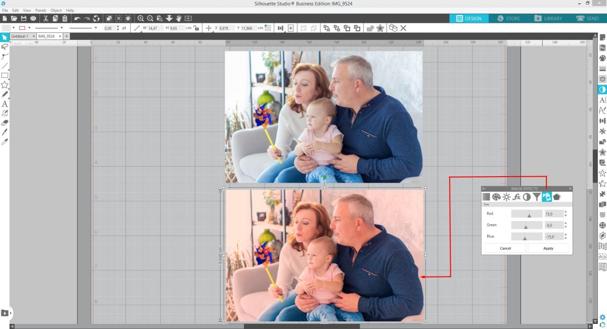
Step 7 – Control Red, Green and Blue with Tint Effect
The Tint Effect allows you to change the Red, Green and Blue tones individually. Each one adjusts how much of that color you want in the photo. Click on the Tint Effect and adjust the Red to 15, Green to -9 and Blue to -15. The photo takes on a rosy look.
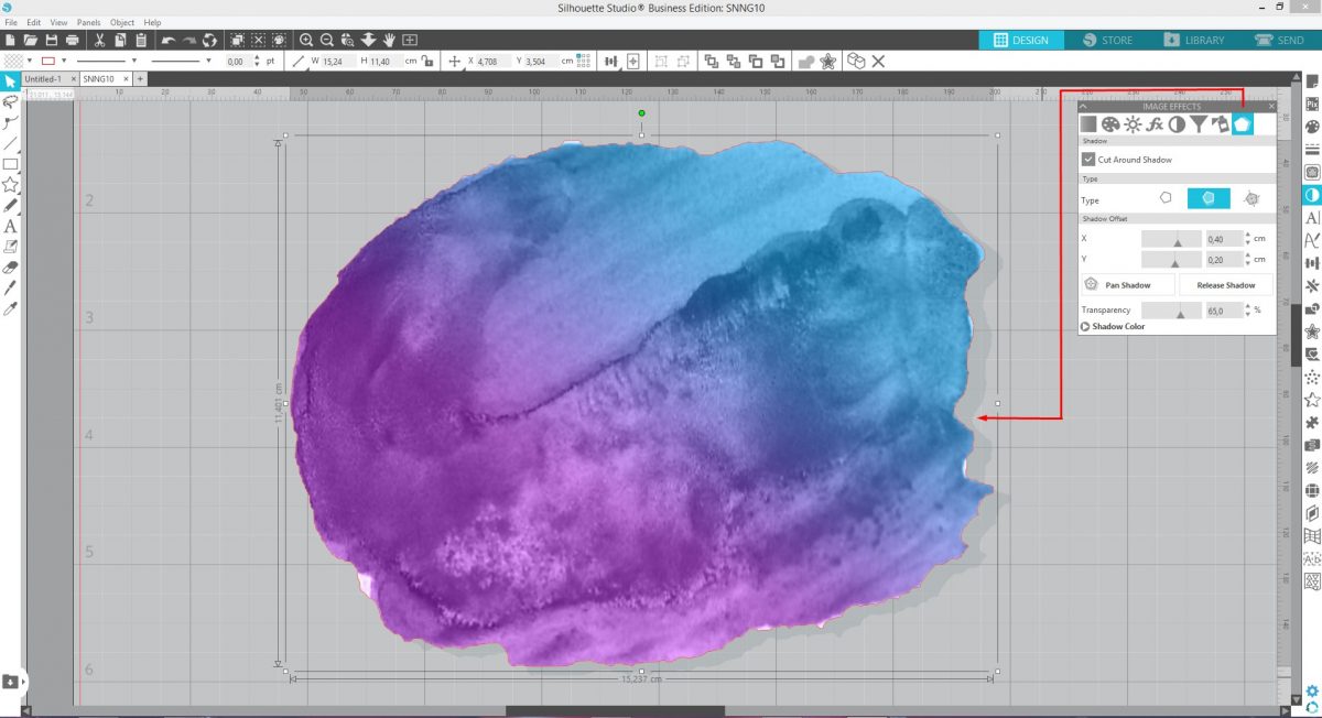
Step 8 – Add the Shadow Effect to clipart
The Shadow Effect is available in Designer Edition and higher. A drop shadow is added to photos, shapes and text.
The results of this effect works better with clipart and text than a photo. On a photo, a shadow is applied to the surrounding edge. For this example we will use a watercolor clipart. Click on Shadow and under Type click Dynamic Shadow. The shadow can be offset on the X or Y axis and the Transparency adjusted.
Clicking on the Shadow Color opens the color palette. Adjust the color if needed.
The shadow can be panned or moved around. Click Pan Shadow and a small circle with directional arrows appears. Click and drag this circle around to reposition the shadow.
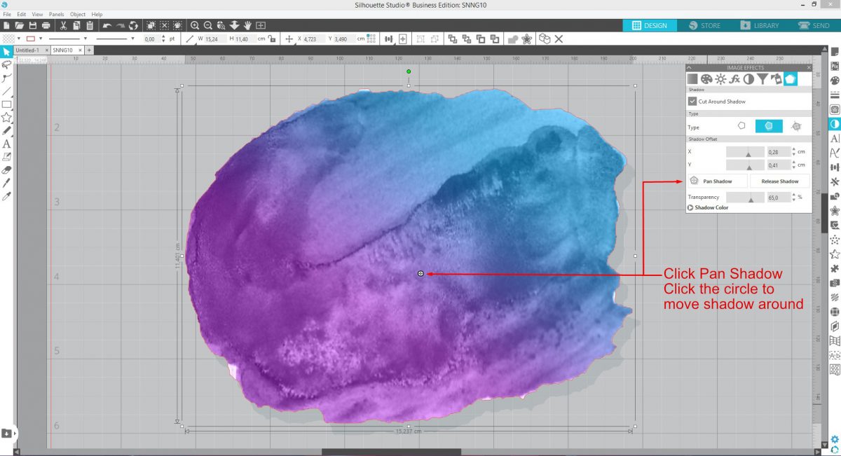
Fixed Shadow keeps the shadow in a set place when moving or rotating the object. Dynamic Shadow will adjust when rotated as if it was a real light source.
Cut Around Shadow is selected when you want the cut area to include the shadow.
When you are done editing click on Release Shadow. The shadow can no longer be edited with the Shadow Effect but it can be edited with the Point Editing Tool.
Have fun experimenting with the Image Effects panel. Combine different effects for an overall result.